SCƐNTRDHome Fragrance
A symbol-led identity for a natural reed-diffuser brand founded by two sisters. The brief began with Ghanaian heritage, family, calm and intentional living. The answer was a mark that carries that meaning without borrowing anyone else’s visual language.
- Client
- SCƐNTRD (founders Charlene & Mandy)
- Year
- 2026
- Role
- Brand identity, Creative direction, Brand story, Packaging direction
- Status
- Identity delivered. Published with the founders tagged.
Home fragrance · Brand identity · Symbol system · Creative direction
01 · The brief
Some brands need a logo. This one needed a symbol.
SCƐNTRD makes natural reed diffusers for intentional living. Sisters Charlene and Mandy wanted a brand rooted in their Ghanaian heritage, in family and in the women who came before them, built around one idea: scent can turn a home into somewhere to exhale, reset and find your centre.
The first direction placed traditional Ghanaian symbols directly into the identity. It was the obvious move, and that was the problem. Sometimes the strongest design decision is knowing when not to force the obvious solution.
- Client
- SCƐNTRD
- Category
- Home fragrance
- Positioning
- Quiet luxury home fragrance
02 · The mark
One symbol, three meanings.
- 01
The Sanctuary Vessel
The full symbol: a vessel for home and self, a ritual offering and a sense of balance. Used for the master brand, packaging fronts and embossing.
- 02
The Bowl
The lower half, the calm vessel: the space and the grounding. Used on candle labels, packaging undersides and as a quiet repeat pattern.
- 03
The Bloom
The upper half, scent in motion: release and atmosphere. Used for room mists, refills and anything about how the scent moves.
- 04
Product logic
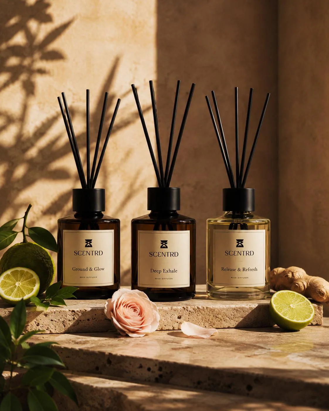
Diffuser carries the full symbol, candle the bowl, mist the bloom. A product range that explains itself without extra graphics.
03 · The world
Warmth, stillness, connection.
The identity had to work beyond a guidelines PDF. Art direction carried the same story into product campaigns, interiors, gifting and a material study that nods to Ghanaian craft through texture and object rather than borrowed pattern.
“An identity inspired by the meaning behind their heritage rather than simply borrowing its visual language.”
Project notes
The record
What is real, what is proposed
Verified facts
- Client, founders and brief as published on your Instagram with both founders tagged.
- Mark meaning, sub-icons and product mapping from the brand story document delivered with the logo files.
Original creative decisions
- Rejecting literal Ghanaian symbols in favour of an original mark; three-part symbol system; Ɛ in the wordmark.
Actually implemented
- Logo suite (lockups, icon, bowl, bloom) in colour, black, white and greyscale; pattern; brand story and positioning suggestions.
Retrospective additions
- Product, packaging and lifestyle scenes are visualisations, not photographs of produced stock. Several are AI-assisted: confirm which.
Proposed or speculative
- Positioning lines and manifesto copy were offered as suggestions; confirm what the founders adopted.